Now that most sane and rational people have awoken from their slumber to the realization that COVID-19 isn’t the deathly plague that the media would like you to think it is, they’re beginning to agitate against government restrictions on businesses, mandatory mask laws, and other tomfoolery. But there are still a significant number of people who remain deathly afraid of COVID. Why are they so paranoid?
You’ve probably seen these people in the grocery store or on the street. They’re the ones wearing masks, face shields, and hoods in 95-degree weather. They’re the ones who cross the street when they approach you on the sidewalk, lest they get within six feet of you. They’re the ones who are too scared to put their credit card in the payment slot at the cashier because you’re unloading your cart five feet away. And they’re the ones who look bug-eyed at anyone they see not wearing a mask. Yes, they may be crazy and irrational, but there’s a reason for that.
Read anything in the media and you’ll see that most articles about COVID are trying to scare the bejeesus out of people. Not only that, but they craft a narrative that’s completely at odds with the facts. Take a look at Sweden, for instance, which the mainstream media loves to malign. They’re still running articles about Sweden’s “failed” policies, as the country didn’t close businesses, didn’t ban churches from opening, and didn’t require face masks. Just about any article you’ll read will decry the failure of these policies, talk about Sweden’s high death rate, and give an open platform to critics of the policy. But what is the reality in Sweden?
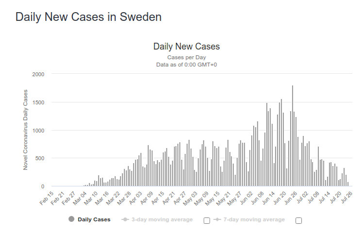
Here are daily new cases:
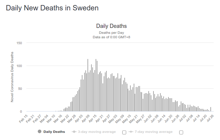
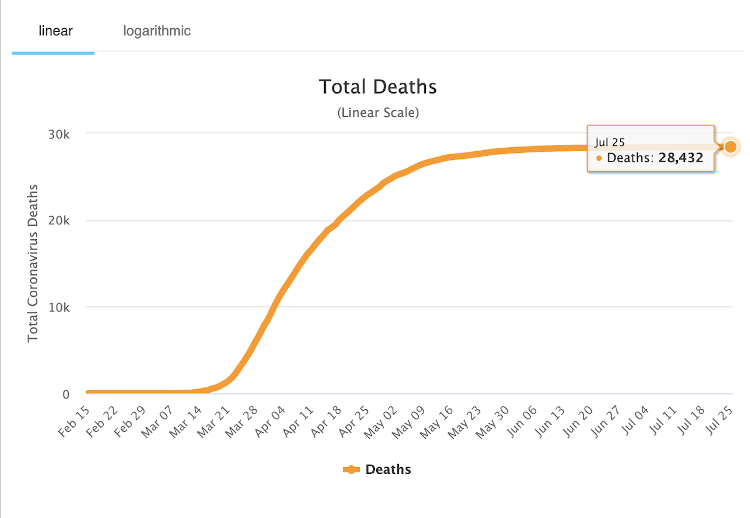
And here are daily new deaths:
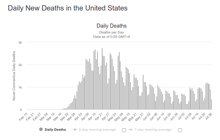
Does that look like a failure to you? Sweden may have had a spike in cases in June, but deaths have been falling ever since April. Compare that to the US:
Which would you prefer?
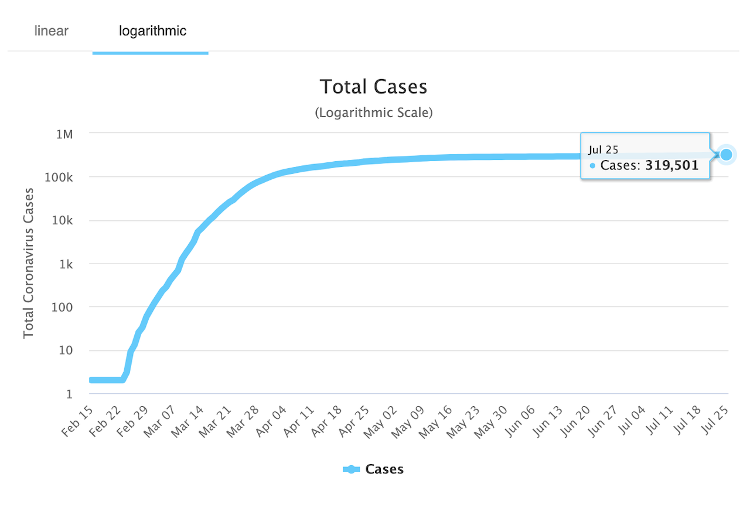
Then there’s the way that statistics are presented. Look at these two charts, both pulled from a recent online article.
They both make it appear that cases and deaths are moving in a similar manner. But if you look closer, you’ll notice that the chart for cases is on a logarithmic scale, while the case for deaths is on a linear scale. So in reality, if both were to be graphed linearly, and especially on the same chart, they would look far different. But that doesn’t scare people, because then they could see that even though case numbers are increasing, deaths aren’t. And the media and politicians want to obscure that so that they can keep people afraid and subservient.
The moral of this story is, take everything you read in the media and everything you hear from your politicians with a great grain of salt. If a politician (and that includes Fauci) says something, you can bet that the truth is completely different. Look at the numbers critically too, and don’t give in to the peer pressure from the less-informed sheep around you to fall in line with the herd. If we don’t fight back against this propaganda, we might as well give up all our rights.
